THE HUMAN INSIGHT
The brand was based around the ripple effect idea, the thought that along each step of the journey a ripple could radiate outwards and through that those interacting with JoyCorps could choose whether it was joy that radiated outwards or not.
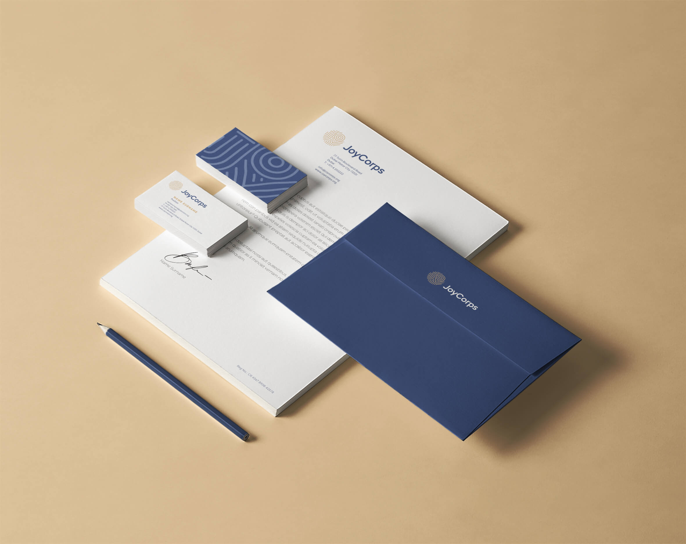
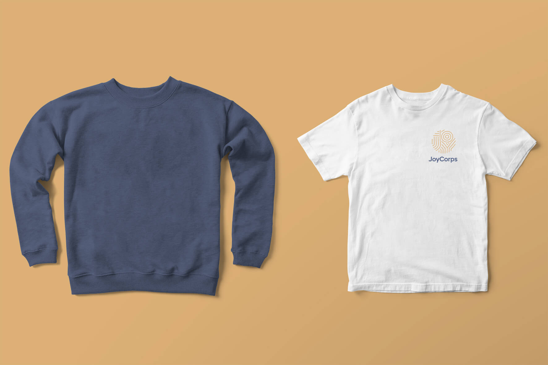
The ripple effect was used in pattern devices and crafted into the emblem used
within the brand mark. JOY with ripple lines emanating from the O outwards, which informed the design of the J and Y. It was inspired by the human thumb print and fabric patterns. A muted colour palette was chosen to allow the joy to shine through in other areas. Together the brand worked together to create circular shapes which represented a symbol of purity, oneness, regeneration and of course, Joy.