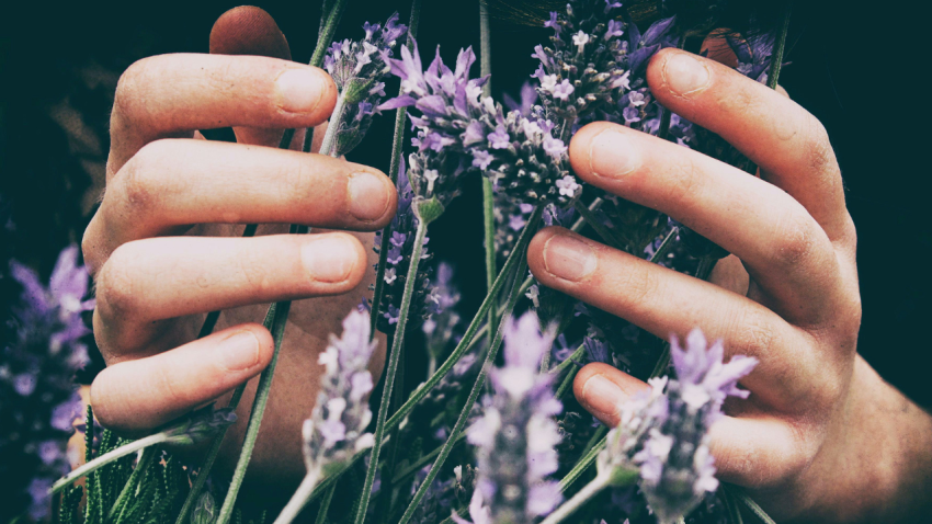
Branding and Design Trends for 2019
Posted by: {johnwatkinson}. 12.03.2019
Each year brings about a new set of trends, and 2019 is no different. Customer expectations and preferences play a big role in a company’s success, so you need to make sure that your branding and logo speak directly about your brand value to your target consumer.
If your business is going to capture the attention of the masses, the design language of your brand needs to be on point. By reviewing current trends in logo creation, colour and all things design, you can examine what you have to offer with open eyes, fully aware of what customers want to see and giving you the power to build brand loyalty.
To determine which direction is right for you, we’ve listed 10 design trends that are taking over 2019 and that need to be on your radar.
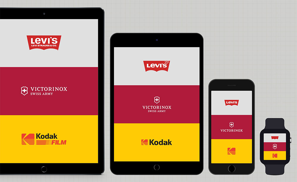 Gone are the days where a single logo is all you need for your brand identity. Today, designing responsive and optimised options is a necessity, particularly if you market in the digital space or aim at multiple customer bases.
When designing a logo, a set of flexible options is usually considered with multiple platforms and media channels in mind. For example, designing what we call a “shorthand” symbol, which is essentially a simplified version of your parent logo may be a better option for smartphone app efficiently used on newsletter mastheads.
Additionally, if your product offering is diverse, then creating a flexible logo system for each segment or product line may sometimes assist in better showcasing your brand architecture. This can be achieved by slightly changing shapes or even colours all whilst retaining the original look and feel of your parent logo.
The most important thing to keep in mind while designing a flexible logo set is to never go beyond 3 or 4 iterations lest you create too much confusion for your customers.
Serifs can be ideal for logos, headlines and disclaimer copy if your company’s strategic design approach is to convey a sense of maturity and class. Serifs have an incredibly distinguished look when used sparingly, adding flair and – dare we say – opulence to brand names or taglines.
So designers have opted to soften this trend by using brighter more vibrant colours creating a warmer and more welcoming personality.
Similarly, instead of keeping with the straight lines, many designers have embraced graceful curves to soften the geometric look. The end result is incredibly clean but also slightly playful, adding brand value and making your business seem approachable and energetic.
 Instagram’s rebranding in 2016 put gradients on everyone’s radar, creating a resurgence of a once forgotten trend. This year, we expect a continuation of this trend from the years past.
A gradient can be incredibly impactful even when the shifts between the shades of colour are subtle. It can also make simple designs feel more detailed and intricate and can add much needed depth to 2-dimensional logos and systems.
Choosing the right colours to create your gradient can really change the feel of your logo. A subtle gradient made of colours that are close on the colour spectrum can feel very gentle and soothing; a dramatic gradient combining lights and darks can burst with energy for a more dynamic look.
We’ll also see, as previously mentioned, the return of the gradient which in itself will achieve depth and movement in flatter designs.
With the emergence of incredibly high-resolution phone displays and tablets, the need to create more engaging designs will be needed.
The recent hipster movement has helped in bringing vintage design into the modern sphere through a different lens; you may opt to use a monochromatic palette (or even a simple black and white) and embrace white space — this creates a more contemporary design look & feel and retains the authenticity of the brand’s identity. We’ll see this happening a lot in logo and packaging design.

Wordmarks are genuinely an exercise in clean design, so they can be incredibly iconic. Plus, they are highly adaptable, working well online, in apps, on business cards, and nearly anywhere else you can imagine.
However, that does not mean they don’t have personality. Selecting the right typeface and applying the right colours can make these simple logos exceptionally unique. Nearly any vibe can be captured with a wordmark, so you can create one that aligns with your brand identity.
Although we’ve seen this trend before, using negative space in logos to create double meaning is still on the rise and will continue throughout this year.
As brands become more complex and as the need to communicate multiple USPs rises, the need to create more complex visuals increases simultaneously; thinking through the negative space may lead designers to create logos that can communicate all the want in one simple and witty visual.
 In years past, we’ve seen a toning down of colour palettes and the emergence of pastels once more. This went hand-in-hand with flat design and the resurgence of vintage, hipster-driven designs. However it’s very clear that vibrancy is making a comeback into our lives.
Pantone® colour of the year for 2019 has been announced to be “living coral”, a fresh, lively and daring colour that is full of energy and zest.
This year we’ll see a rise in vibrant non-traditional colours as a reaction to high-performance displays and a growing trend in digital interactive platforms.
If you want to fully rebrand or simply freshen up your logo according to your brand guidelines, consider your brand’s vibe and select an option that feels right. Whether you favour minimalist, playful, traditional, or cutting-edge styling, we hope you find the trend that truly matches your brand.
Happy branding!
If your business is going to capture the attention of the masses, the design language of your brand needs to be on point. By reviewing current trends in logo creation, colour and all things design, you can examine what you have to offer with open eyes, fully aware of what customers want to see and giving you the power to build brand loyalty.
Top 10 Design Trends for 2019
We understand that, at times, change is necessary if a business is going to grow and thrive. In some cases, a full rebranding may be required. In others, a small update could be all it takes to remain on top. And sometimes, you and your company may not need to change at all just yet — but it’s always good to keep perspective and plan ahead.To determine which direction is right for you, we’ve listed 10 design trends that are taking over 2019 and that need to be on your radar.
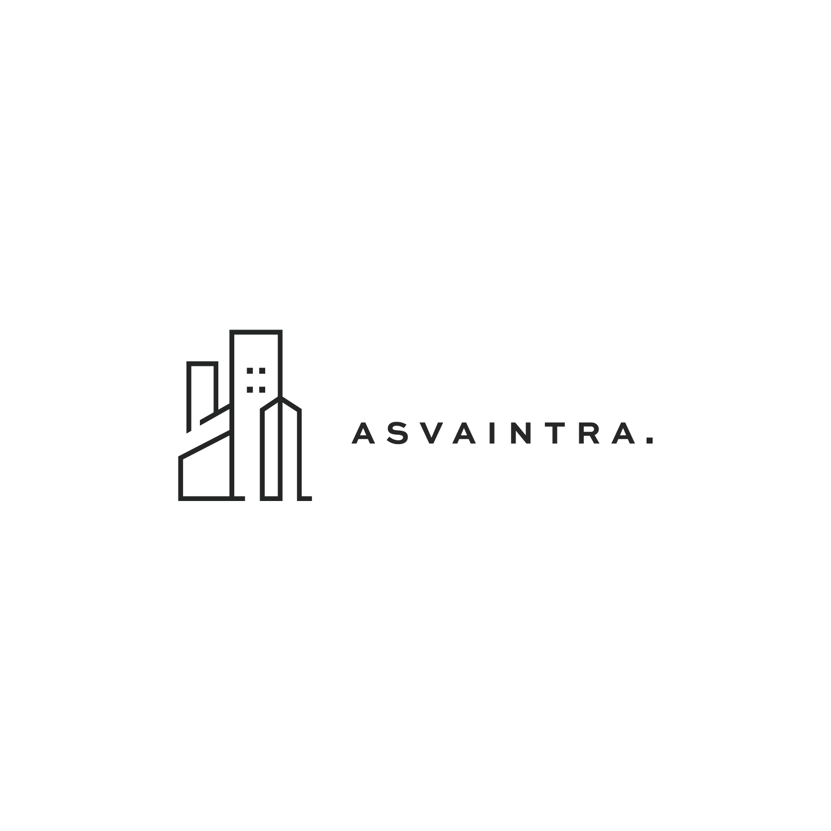
1. The Flexible Logo Set
Photo Credit: Joe Harrison Design Ltd
When designing a logo, a set of flexible options is usually considered with multiple platforms and media channels in mind. For example, designing what we call a “shorthand” symbol, which is essentially a simplified version of your parent logo may be a better option for smartphone app efficiently used on newsletter mastheads.
Additionally, if your product offering is diverse, then creating a flexible logo system for each segment or product line may sometimes assist in better showcasing your brand architecture. This can be achieved by slightly changing shapes or even colours all whilst retaining the original look and feel of your parent logo.
The most important thing to keep in mind while designing a flexible logo set is to never go beyond 3 or 4 iterations lest you create too much confusion for your customers.
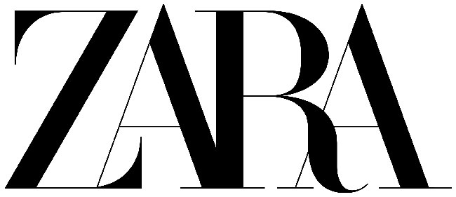
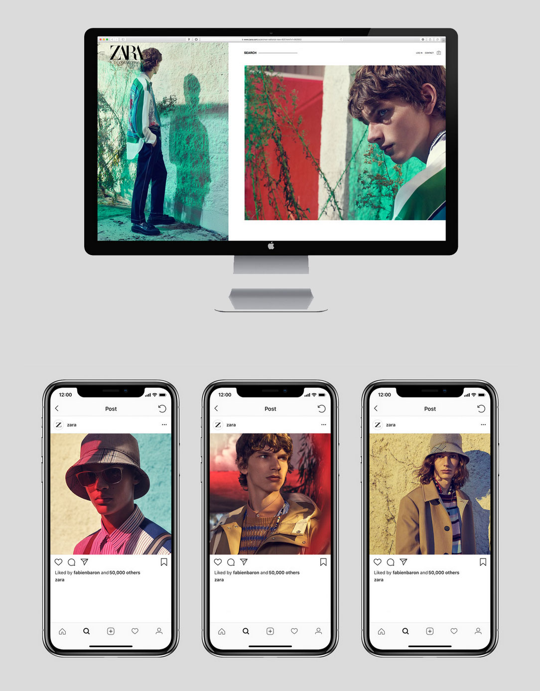
2. The Return of Serifs
Over the past few years, minimalist fonts have dominated the landscape. Not only do they load faster online and are easier to read on smaller screens, but they also tend to feel modern and cutting-edge. No matter your personal view on this, even iconic brands like Burberry have chosen to move away from Serifs, embracing the minimalist trend that continued to dominate through 2018. Photo Credit: Zara by Baron Baron on Brand New
Photo Credit: Baron & Baron
Serifs can be ideal for logos, headlines and disclaimer copy if your company’s strategic design approach is to convey a sense of maturity and class. Serifs have an incredibly distinguished look when used sparingly, adding flair and – dare we say – opulence to brand names or taglines.
3. Softer Geometrics
Functioning as a counterpoint to the return of Serifs, friendlier and more vibrant geometrics are making waves in the logo arena for companies that want to come off as more approachable. Geometric logos are designed using mathematical formulas and strict underlying grids to create an abstracted more modern look. But this can create a rather cold and distant approach.
So designers have opted to soften this trend by using brighter more vibrant colours creating a warmer and more welcoming personality.
Similarly, instead of keeping with the straight lines, many designers have embraced graceful curves to soften the geometric look. The end result is incredibly clean but also slightly playful, adding brand value and making your business seem approachable and energetic.
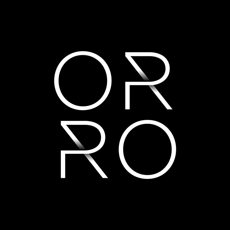
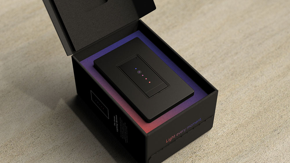
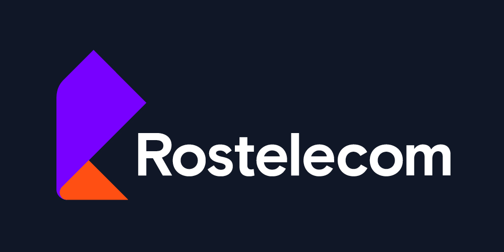
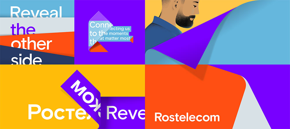
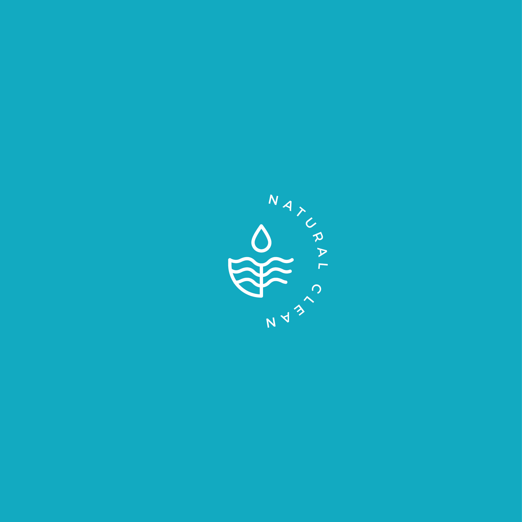
4. Gradients on the Rise
Photo Credit: Orro by Enlisted Design
A gradient can be incredibly impactful even when the shifts between the shades of colour are subtle. It can also make simple designs feel more detailed and intricate and can add much needed depth to 2-dimensional logos and systems.
Choosing the right colours to create your gradient can really change the feel of your logo. A subtle gradient made of colours that are close on the colour spectrum can feel very gentle and soothing; a dramatic gradient combining lights and darks can burst with energy for a more dynamic look.
Photo Credit: Orro by Enlisted Design
Orro Brand Animation from Enlisted Design on Vimeo
5. Bringing Back Depth
Flat design took over for a good number of years especially in digital; Apple’s redesign of iOS 7 led the way into flat design in 2013 and the trend has continued since. But this year we’ll see the re-introduction of shadows to create subtle depth and perspective.Photo Credit: Brand New
Photo Credit: Saffron Consultants
We’ll also see, as previously mentioned, the return of the gradient which in itself will achieve depth and movement in flatter designs.
With the emergence of incredibly high-resolution phone displays and tablets, the need to create more engaging designs will be needed.
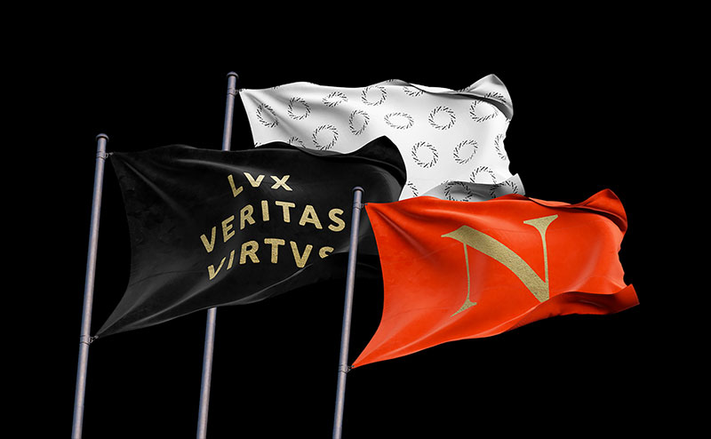
6. Back to Vintage
Rest assured though, three-dimensional gradient-infused geometric logos are not for everyone. For many smaller brands, an authentic vibe makes them more attractive to consumers who are shirking the big-box stores and favouring small, local businesses that feel like part of the community. Often, a logo that feels hand-crafted enhances that feeling, adding a sense of quaintness or invoking a simpler time.The recent hipster movement has helped in bringing vintage design into the modern sphere through a different lens; you may opt to use a monochromatic palette (or even a simple black and white) and embrace white space — this creates a more contemporary design look & feel and retains the authenticity of the brand’s identity. We’ll see this happening a lot in logo and packaging design.
Photo Credit: Northeastern University by Upstatement on Brand New
7. Extreme Minimalism
As we all know and appreciate, the logo is not everything when it comes to building a brand identity. And as such, brands should not expect their logo to do all the heavy lifting. It is for this reason that many brands, and most recently the luxury sector, have opted to simplify and streamline their logos in a way that makes them almost bland.Photo Credit: Marija via 99designs
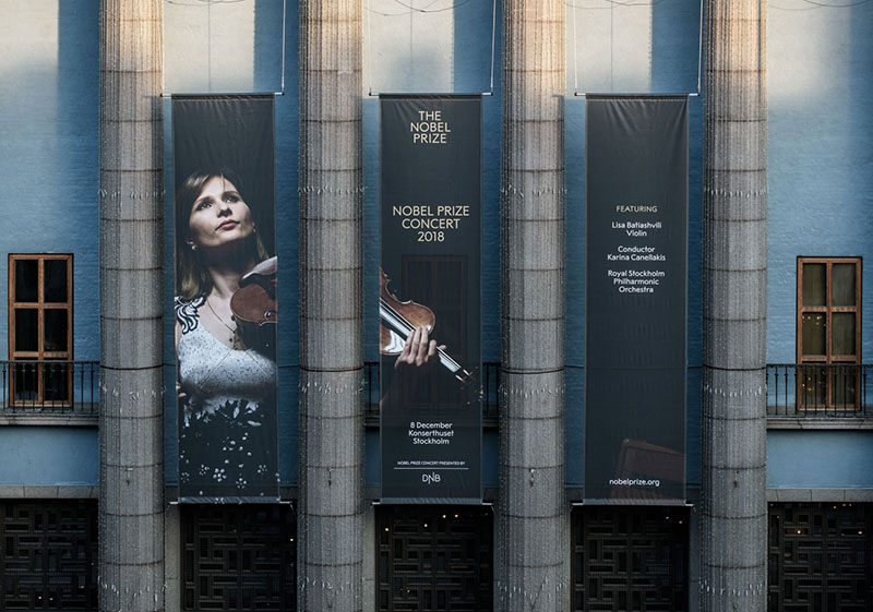
8. Wordmarks
Along the same lines, when it comes to minimalism, the workmark, a typography-driven logo design, is about as simple as it gets.Wordmarks are genuinely an exercise in clean design, so they can be incredibly iconic. Plus, they are highly adaptable, working well online, in apps, on business cards, and nearly anywhere else you can imagine.
Photo Credit: Stockholm Design Lab
How stars shine from Stockholm Design Lab on Vimeo.
Penicillin from Stockholm Design Lab on Vimeo.
Photo Credit: Stockholm Design Lab
However, that does not mean they don’t have personality. Selecting the right typeface and applying the right colours can make these simple logos exceptionally unique. Nearly any vibe can be captured with a wordmark, so you can create one that aligns with your brand identity.
9. Witty Negative Space
When it comes to logo design, designers have always challenged themselves to create simple yet smart designs that can convey the brand’s underlying positioning and simultaneously establish recognisable symbols that engages customers.
Although we’ve seen this trend before, using negative space in logos to create double meaning is still on the rise and will continue throughout this year.
As brands become more complex and as the need to communicate multiple USPs rises, the need to create more complex visuals increases simultaneously; thinking through the negative space may lead designers to create logos that can communicate all the want in one simple and witty visual.
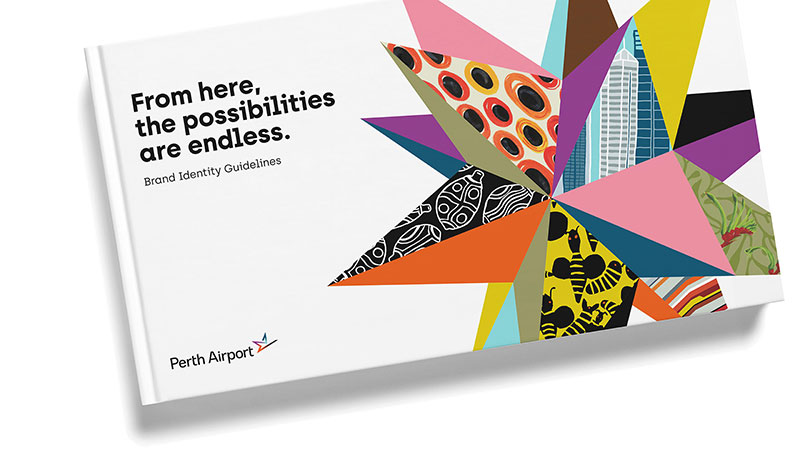
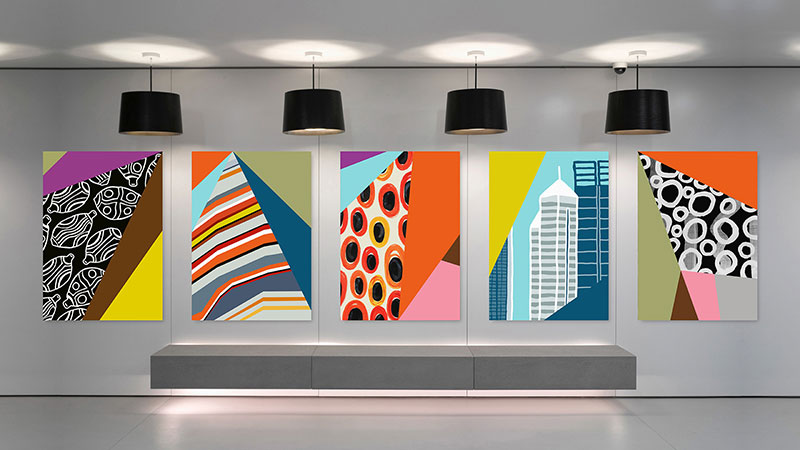
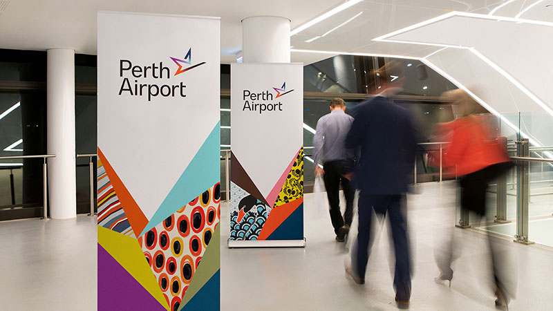
10. Keeping it Vibrant
Pantone® colour of the year for 2019 has been announced to be “living coral”, a fresh, lively and daring colour that is full of energy and zest.
This year we’ll see a rise in vibrant non-traditional colours as a reaction to high-performance displays and a growing trend in digital interactive platforms.
Photo Credit: Push Collective for Perth Airport on Brand New
Final Thoughts
It is clear that 2019 is going to be an interesting year in the logo creation and branding space, largely because not all of these trends are heading in the same direction. But, this also creates an amazing opportunity, as the variety means the market won’t be saturated with a single approach, making it easier for your brand value to increase and your brand to stand out.If you want to fully rebrand or simply freshen up your logo according to your brand guidelines, consider your brand’s vibe and select an option that feels right. Whether you favour minimalist, playful, traditional, or cutting-edge styling, we hope you find the trend that truly matches your brand.
Happy branding!